Tuesday, January 4, 2011

Swim Team Shirt

Idea-  I think for my next project i am going to work on a t-shirt design for the high school swim team.  I am thinking something with the team name and including the mascot, colonials.  I have to think about colors cause i know that not too many colors can be used.  Also i do not really exactly know what colors.  Maroon has to be included cause that is the school color and probably also white.  In the past we have had black shirts with maroon, white and orange.  We have also had shirts that are maroon with white and black writing.  I really liked the sweatshirt we had that was large capital M and had goggles and a little colonial hat on the top of the M.  I want to do something similar to that cause in the past the shirts have only had words on them like Morristown High School Swimming and then a quote on the back.  
Specs-  I found a t-shirt vector and am going to put the design for the shirt in it so it is proportional to how it would be if the shirt is printed. 
Research-   I looked online at other t-shirts and did not really find stuff so i looked at the different things from years past and other teams that i have.  
Somethings i would like to include:

  • Goggles
  • Colonial hat
  • Traditional swimmer (butterfly)
  • Large Capital M (for Morristown)

Planning-  ( I had other sketches, but am having some trouble scanning them on)


Comps-  I first made the goggles that i want to have in the design and i am going to make the colonial hat next.


I got this simple idea for the hat from past shirts.  I added the M because i am not sure where or how i am going to use the hat

This is the swimmer i made.  It is found on a lot of t-shirt so i do not think i am going to use this but i wanted to make it to see how it would turn out.

 
These are the first 3 i made and i like the large M but am not a huge fan of the goggles because i can not get them to sit right on the M.  It is soposta look like it is hanging on but I do not think i got that look. 


I made these two and added the picture on the sleeve.  I really like having the M there, but do not like having the the swimmer out like large or on the shirt at all really.


I took my four favorite designs and made some changes to them.
I changed some of the fonts and colors.  I think my favorite would
either the M with the goggles or with the hat.  I fixed the way the goggles
sit and i like it a lot better.  Instead of two strap i made it one and made it
so that it disappears partly behind the M so it actually looks like it is hanging.  I still like the idea of having something on the sleeve, but i just am not sure i can find the right combination of icons. I do not really like the swimmer and that knocks out those two shirts and to put something on the sleeve of the other 2 shirts would probably have to be a swimmer and i do not really want that on the shirts because it has been done before and i do not really like the look of it.

Monday, December 13, 2010

Surrealistic Room

Idea- I am thinking of doing a project where what looks like a box with some sort of outdoor kind of thing inside it inside of it.  
Specs- I am going to be doing it in Photoshop in a 3000px by 3000px document.
Research-  I found a tutorial for this where is look like a boat on water and and the sky has the corners of a box.  I am excited to get started on this.  After the tutorial i hope to make one of my own with different components but keeping the same idea of it being inside a box.
I am having a little trouble with the tutorial.  There are many different kinds of brushes that needed to be used to put waves in the corners and i had lots of trouble getting these brushes.  The tutorial did not turn out as well as i hoped it would cause i also could not find some of the pictures i needed and finding similar ones was difficult too.  The tutorial came out pretty good and i figured out a way to make the sides look less hard on the other room i am making


 Comps-
So for the room that i made i found a background picture of trees and it had a path in it and decided that it would look good with the water flowing out from it.  I also used the clone stamp and put the on the edge to make it look a little better and not as hard and ridged. 

Friday, December 10, 2010

Storefront


Idea - So for my next project i am thinking of making a storefront.  I was looking online at tutorials and found this idea.  I think it would be cool to make the outside of the store and a logo for the store and maybe like a display kinda thing outside of the store. Also i could add like plants outside of the door. I have to think of a name for the store and like what they are going to sell.
SpecsI think i am just going to to size it on a 8.5 by 11 box on illustrator.  All the tutorials say to just create a rectangle and nothing to specific with size.
Research-  I found this idea looking up tutorials and so i have 2 tutorials i found that are kinda similar. I also looked up storefronts on google images and am getting an idea on an overall style.  Now I have to get started on my sketches.
Planning-

comprehensives-  I made this with the help of a tutorial i did before.  The tutorial helped me make the windows and give the roof a curved look.  I was still having some trouble giving it a curved look but it looks better then when I started.  I wanted to maybe have some chairs and a table outside but was not sure how to make it.  I looked for a tutorial but only could find one for what looked like a kitchen or dinning room table and that not really what i wanted.  I wanted it to look like those table not made of wire but kinda what look like it.  Like think plastic i am not really sure what it is.

Monday, November 8, 2010

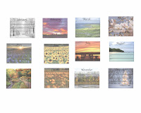
All the calendars

Revisions
I looked a the comments everyone left me after i posted up the calendars and made a few changes.  I added the  year and made sure everything was centered right cause i found a few that were a little off.  Also when i posted my calendars before i missed some of the days in a couple months and made sure to get them.  


I put the year on both sides because i did not like having it on one side and the month on the other.  I did not like the way it looked, I thought it looked off center and putting it on both sides i thought it looked better on both sides.


These are the first ones i made and it is with the traditional style boxes but not with the picture above the boxes.
This was the second idea and i separated the boxes making each day individual.
This was the third idea i had making the week grouped together so if something lasts the whole week it can be written down instead of in each days box.

Calendar

So i have come up with a couple different ways to display the calendar.  The different styles are all slightly similar.  I have also looked at the traditional calendar style although it is not my favorite style.  I like having the picture as the background and lightened the photos to make sure that number of the month can be seen and if something is written.

Monday, October 18, 2010

calendar progress

Unfortunately I missed the last class and did not do anything new.  I am going to continue setting up the calendar and everything else.

Friday, October 8, 2010

Calendar

So I have been working on my calendar and it is going pretty well so far.  I have found some of the pictures for the months that i really like.  I am having some trouble finding pictures for months like June, July and August because i do not want the pictures to look alike. I also have started thinking about what i want to do for my next project and was to do something with an animated character, like re-createing one.