This is what i did for my final. I am going to use the swimming shirts i made earlier in the year. I want to make a poster about the swim team. I want to make it like a join the team poster and maybe put some of their information on it. I am going to use the logos from the t-shirt i designed.
When i started to make the poster i was not really sure what to do with the background so a the time I had a simple blue gradient on it. When i wanted to put a better background i found a photo of water and put it into illustrator. After i rasterized it i turned the opacity down and had a blue box behind it to form a more interesting background image that was not too distracting. The background is my favorite part of the poster. I have never really done anything like that for a background before.
Another thing was withe the pictures. First i got them off the swim team website and then put them into illustrator. Once i realized that i need to do something so they blended a little better into the background and did not have such harsh edges. I opened the pictures into photoshop and there i used the blending tool. I selected the edge of one picture at a time and then contracted the selection. After i selected its inverse i used the blur tool to create smother edges. I also tried not to pick to many fonts or fonts that were hard to read, but i did want to have a little variation and that is why i put the records in different font.
Wednesday, June 15, 2011
Wednesday, June 8, 2011
Monday, May 9, 2011
Toys for tots poster
Idea- for my next project i am going to make a poster. when i was looking online for and idea i came across a toys for tots poster. I thought i could redesign it or create a new one.
Specs-8.5x11, in illustrator, and i am going to try to keep it colorful, but not overwhelming.
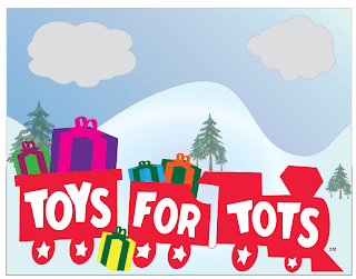
Research- This is the poster i found. I am going to use their logo, but maybe add some color to it. I want to keep it simple, but fun. As i was looking online a lot of the posters had too much going on or i just did not like how they looked.
 I tried using a tutorial to make presents but am having trouble following it and can not quite understand the steps so i am going to make my own.
Specs-8.5x11, in illustrator, and i am going to try to keep it colorful, but not overwhelming.
Research- This is the poster i found. I am going to use their logo, but maybe add some color to it. I want to keep it simple, but fun. As i was looking online a lot of the posters had too much going on or i just did not like how they looked.
I re-made the logo so it would not be pixely or anything. I had a little trouble with the letters but other than that it was not that bad.
 I tried using a tutorial to make presents but am having trouble following it and can not quite understand the steps so i am going to make my own.
This is the present I made. I had some trouble with the bow and it still does not look that great, but it looks worse without it.
So I i put everything together and i first started with the poster the long way, but then i realized i had a lot of wasted space. I rotated it and made the train bigger so it took up the majority of the space.

Thursday, May 5, 2011
Bookmark
I found this tutorial and at first I was having with this gradient thing that needed to be put on overlay. The first one is when i was not quite getting the gradient right. I realized i needed to add a shape on the layer the that the gradient was going on. The second on i got the gradient right but still had a little trouble with the sizing of the brush and the blur effect but i think it came out a lot better then when i stated.
Monday, April 25, 2011
Package Design Revisit
So I am going back to the Quaker box and i am going to add a color into the background because it was white before and looks very plain.
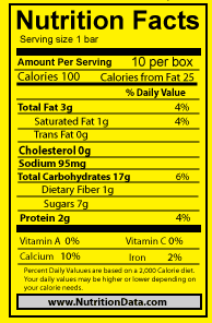 So i went back and re did the Nutrition Facts box because before I could not change the color. I followed the original and matched the sizes and fonts to get this. now i am going to work on he grain because it has a white-ish outline.
 So i went back and re did the Nutrition Facts box because before I could not change the color. I followed the original and matched the sizes and fonts to get this. now i am going to work on he grain because it has a white-ish outline.
I am working on getting the grain to fit well with out it having a distracting white outline. I tried bring the grain into photoshop to remove the white and tried doing it in illustrator. I had a lot of trouble with this but i had one where i used a gradient so it was not noticeable. Also i was able to get one that the white is not that distracting.
So the top is what i started with and then using the magic wand tool and Brads help i got it to the bottom. There is still some white left, but if i try to get ride of that it cause then i would lose the top of the grain and then it would not look like grain.
So i switched the grain in on this box and at first there was still some white and i did not like how it looked. So then i tried a gradient to cover the small white spots. So then i had to add a gradient on all the parts of the box. I was not sure which ways to make the rest of the gradients so i just made any of the same sized panels the same way. Then i went back to work on the grain because i really did not like having the gradient. I got the grain closer to what i wanted this time and that is what is on the first box.
Looking at this there are still some white, but i do not think it is distracting or anything. I think it just looks like the top part of the grain and how it is soposta be. I like the solid color box the best. 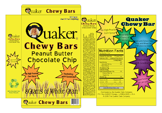

So this is my box with a colored background i chose a lighter yellow that was not as bright. I tried some different colors like greens and oranges but i think the yellow looked the best
Wednesday, April 13, 2011
Midterm
This is my midterm project as i was going through my things i thought i should put it up with everything else. I kind of like how it came out.
Monday, March 21, 2011
Recycle Poster
For the PGC recycle poster we have to make i have been looking at some posters that have already been made and found some that i liked. I like these 2 posters. I like the one cause it makes the recycle symbol with water bottles. I like the other one that makes the shapes but also makes a picture. Another thing I like it is not all about green in them. I think i am leaning more toward a blue poster or the majority a light blue.
This is what i came up with. I started with the background and i was thinking about adding some kind of trees or bushes, but i did not think they fit in that well so i decided to not do them. I tried to keep everything big and fun so that no one has to walk up and have to stare at the poster for a while to figure out what it is about. I tried to make the idea clear in the poster.
I made the fonts a little bigger and played around with the effects and this is what i came up with and i don't think it came out half bad. I chose not to have the curved lines I think it looks a little better not having all the words curved. I tried to add affects to the words so that attention would be drawn to them. I like the look it ended up with because it is not the normal green sign that says recycle. It has other aspects about it, but keeping the same ideas of recycle and green.
Sketches- The slogan i picked for the poster is the Earth is your Fan if you recycle that can. So I started to think of ideas on what my poster could look like. i did not want the whole poster around the recycle sign so i started to think if i associated each of the important words with a picture. So i started with fan and i was thinking about the little triangle things that colleges have that say the schools name on them and have them around the fan. I also liked the idea of the can or a bottle for part of the n. Although i did not want the whole poster around the recycle sign or green i could not completely ignore it so around recycle i was thinking to put the recycle symbol. The other sketches which i did not like that much had the earth as the background and i just thought the other idea was better.
This is what i came up with. I started with the background and i was thinking about adding some kind of trees or bushes, but i did not think they fit in that well so i decided to not do them. I tried to keep everything big and fun so that no one has to walk up and have to stare at the poster for a while to figure out what it is about. I tried to make the idea clear in the poster.
I made the fonts a little bigger and played around with the effects and this is what i came up with and i don't think it came out half bad. I chose not to have the curved lines I think it looks a little better not having all the words curved. I tried to add affects to the words so that attention would be drawn to them. I like the look it ended up with because it is not the normal green sign that says recycle. It has other aspects about it, but keeping the same ideas of recycle and green.
Wednesday, February 23, 2011
Package Design
Idea- I am planing on creating a package design for a product. I am not totally sure on what product yet, but i am going to pick an existing product and probably redesign it or add some stuff to it. I decided that I am going to use the Quaker Chewy Bars.
Specs - I am thinking that they specs can be different depending on what product i am using. I just found an outline for a 3-D box that can be used for contacts. I am thinking of using that so the box is realistically design and there is not a side that gets forgotten or information on a side that does not exist. I measured the existing chewy bar and it is 8x6x1.5. So i am going to use that size.
Research- I have been looking at other package designs for existing products and I like having a light color background like white of tan and then having a few bright colors that stand out. I also like an interesting font that also sticks out.
I like these 2 packages because they are interesting, but also simple and not overwhelming.
Planning
Comps-
 I am going to be using this for the back of the box to put this information that I got from the original chewy bar box. I have to add a few more things to the back but for the most part this is what it is going to look like. Also i do not like the background color. I was trying to pick something neutral and I don't no why i chose this color but looking at it now i see that it does not really work so i am going to have to fix that.
 This is what i was think for the front. Again i still have to add some information, but this is kind of a rough idea of what i was going for. I do not know if i want to put a background color on because i can not find one that i really like and that makes it look better so i might leave it white. I know it looks kind of plane now but once i add the rest of the information it will look better. I made the first front and i did not like the logo and how there was very little color so i added the blue box because that is how that sort of have it on the original box. Then i changed some colors and fonts and I like how it came out. I like the font on the second back and i think i am going to leave the background white because I am have some trouble with the Nutrition Facts. I really like all the color stars with the subtle gradient.
This is the first the first box i put together. I started with the first logo i had and kept that going through the whole thing. I made sure to add things like the ingredients and nutrition facts, all the things that would be found on a package if it were seen in a store. After putting this together i realized i liked the other logo and and how there was a little more color to it.
These are what i am thinking of putting on the front of the box. I like the whole grain thing, but i am not too sure about the font. I might change that. I like putting the quaker man in the Q i think it looks kinda cool and different. I also like having a different color stroke around the chewy bar.
 I am going to be using this for the back of the box to put this information that I got from the original chewy bar box. I have to add a few more things to the back but for the most part this is what it is going to look like. Also i do not like the background color. I was trying to pick something neutral and I don't no why i chose this color but looking at it now i see that it does not really work so i am going to have to fix that.
This is the first the first box i put together. I started with the first logo i had and kept that going through the whole thing. I made sure to add things like the ingredients and nutrition facts, all the things that would be found on a package if it were seen in a store. After putting this together i realized i liked the other logo and and how there was a little more color to it.
This is what i put together after the first one. All though the back is almost similar I did change the font which i like much better now. Also i picked the front that had the same star color as the stroke on chewy bars. I liked this better than adding a new color to the front. I tried to keep a flow through out the box.
Tuesday, January 4, 2011
Swim Team Shirt
Idea- I think for my next project i am going to work on a t-shirt design for the high school swim team. I am thinking something with the team name and including the mascot, colonials. I have to think about colors cause i know that not too many colors can be used. Also i do not really exactly know what colors. Maroon has to be included cause that is the school color and probably also white. In the past we have had black shirts with maroon, white and orange. We have also had shirts that are maroon with white and black writing. I really liked the sweatshirt we had that was large capital M and had goggles and a little colonial hat on the top of the M. I want to do something similar to that cause in the past the shirts have only had words on them like Morristown High School Swimming and then a quote on the back.
Specs- I found a t-shirt vector and am going to put the design for the shirt in it so it is proportional to how it would be if the shirt is printed.
Research- I looked online at other t-shirts and did not really find stuff so i looked at the different things from years past and other teams that i have.
Somethings i would like to include:
Planning- ( I had other sketches, but am having some trouble scanning them on)
Comps- I first made the goggles that i want to have in the design and i am going to make the colonial hat next.

Specs- I found a t-shirt vector and am going to put the design for the shirt in it so it is proportional to how it would be if the shirt is printed.
Research- I looked online at other t-shirts and did not really find stuff so i looked at the different things from years past and other teams that i have.
Somethings i would like to include:
- Goggles
- Colonial hat
- Traditional swimmer (butterfly)
- Large Capital M (for Morristown)
Planning- ( I had other sketches, but am having some trouble scanning them on)
Comps- I first made the goggles that i want to have in the design and i am going to make the colonial hat next.
I got this simple idea for the hat from past shirts. I added the M because i am not sure where or how i am going to use the hat
This is the swimmer i made. It is found on a lot of t-shirt so i do not think i am going to use this but i wanted to make it to see how it would turn out.
These are the first 3 i made and i like the large M but am not a huge fan of the goggles because i can not get them to sit right on the M. It is soposta look like it is hanging on but I do not think i got that look.

Subscribe to:
Comments (Atom)


