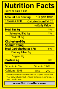
 So i went back and re did the Nutrition Facts box because before I could not change the color. I followed the original and matched the sizes and fonts to get this. now i am going to work on he grain because it has a white-ish outline.
I am working on getting the grain to fit well with out it having a distracting white outline. I tried bring the grain into photoshop to remove the white and tried doing it in illustrator. I had a lot of trouble with this but i had one where i used a gradient so it was not noticeable. Also i was able to get one that the white is not that distracting.
So the top is what i started with and then using the magic wand tool and Brads help i got it to the bottom. There is still some white left, but if i try to get ride of that it cause then i would lose the top of the grain and then it would not look like grain.
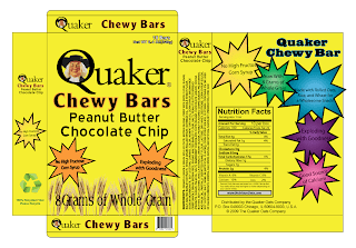
So i switched the grain in on this box and at first there was still some white and i did not like how it looked. So then i tried a gradient to cover the small white spots. So then i had to add a gradient on all the parts of the box. I was not sure which ways to make the rest of the gradients so i just made any of the same sized panels the same way. Then i went back to work on the grain because i really did not like having the gradient. I got the grain closer to what i wanted this time and that is what is on the first box.
Looking at this there are still some white, but i do not think it is distracting or anything. I think it just looks like the top part of the grain and how it is soposta be. I like the solid color box the best. 

So this is my box with a colored background i chose a lighter yellow that was not as bright. I tried some different colors like greens and oranges but i think the yellow looked the best


No comments:
Post a Comment